Monday, March 25, 2013

Painting the panel for a handcrafted “Trumeau” style mirror for the Friends Program auction.


When Bob Larsen asked me to participate, I immediately thought of a photo that Ken Williams had taken of the Merrimack, with the capitol building in the background. I really love rivers and wanted to paint the Merrimack. Terrill park is a really under-used treasure in the Concord park system and the view of the city from there hides the ugly highway. 


My photo from Terrill Park, Concord.
It was a cold, cold, windy day when I ventured out to Terrill Park on my lunch hour. There was a family there, waiting in the car while the mother ran the dog in the dog park. There was open water reflecting the cloudless blue sky and icy patches with snow on the river. The wind off the water made my eyes water. The city, with the capitol towering to the left, was mostly obscured by the trees along the far shore and seemed distant and bright. I searched around to find the spot that retired Monitor photographer Ken Williams shot that long-ago photo I remembered. I even ventured north along the wooded swampy (but frozen) shore where signs forbid trespassing. It seemed unlikely that the police would notice my infringement and I ventured out to the edge of the bank, stumbling near the water and abusing my knee. The view was not significantly better so I abandoned my lawlessness and returned to the park.

Though there was the barest reflection of the dome, I liked the pattern on the water and the glow from the capitol on the ice and snow. The hills were darkish at mid-day and I wondered how it would look on a sunny bright morning. I have a little point-and-shoot camera which didn't bring out much detail in the city beyond the scrub. And I remember the trees looking warmer than the photo came out. I soaked in the view until my toes and fingers were numb and I took refuge in the car.

The city close-up with my point and shoot.

I worked out a sketch from the photo while it was still fresh in my mind and decided that I'd rather have more water than sky, concentrating on the river more than the buildings. Still, it was difficult to make out the particularities of the structures. I asked my friend Alex Cohn, photo editor at the paper, to take a photo from the same spot with his telephoto lens. That helped with buildings. Even if I'm not painting details, I felt like I needed to see them clearly to understand what I was going to paint.
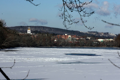
Alex Cohn’s great shot of the city from the same spot.
I glued Claussen's #13 to the panel. I was glad that they allowed me to work on a surface I was comfortable with. I got the call to participate just before my vacation and found myself chomping at the bit in Florida, wishing I could get started on the painting. Since I had my laptop with me, I decided to study the buildings from Alex's photo, by drawing them as a graphic with Illustrator, which became the image used for the promotions and tickets. It enabled me to understand more of what I was going to paint.

The graphic I made while in Florida.
I followed my sketch and the photo I took on site for the shoreline and water, and used Alex's photo for my guide to the buildings and hills. By the time he had taken his photo, the river had frozen almost completely and was covered with snow. The under painting went better than I'd hoped. Curiously, the parts I labored on the most looked weak at best and the parts I barely thought about and only quickly sketched out in paint were the most captivating. One of God's mysteries for sure.

Drying the painting in my make-shift kitchen studio.
This is the list of what I came up with in the following days to eliminate the distractions:
  • Shoreline – redo the line of the far embankment, with more water to the right and bringing the snowy area more the the foreground, slightly lower with water between that and the shore.
  • Darken the value in the large upper water area and dull it to reflect the shoreline slightly.
  • More value changes in the water areas.
  • Extend the point of the right shore and lean branches over the water more, lightening values to be more in line with the lighting.
  • Vary the values in the buildings, show more shadows.
  • Work on the capitol, too skinny and looks like it's leaning.
  • Darken the snow so that the highlights are more prominent.
  • Reflect the dome subtly as possibly, as a glow on the icy patches.
  • Consider redoing the sky
  • Repaint in the hanging branch that I missed in the first go-round but that is prominent in the sketch.
  • Work on the right shoreline.
The finished painting.
I had a good time of playing with the depth of the icy patches and reflections of the sky in the deeper open water. I do love to paint rivers. But repainting the sky would mean extra time to dry, which fortunately, I was able to manage. The resulting sky isn't greatly different than the first one but it glows more and I'm much happier with it. 

The Friends Program is a non-profit organization and the auction is one of the ways they fund the great work they do. I love that my work has been included and that I am in such a great company of artists. Check out the submissions at http://www.friendsprogram.org/events/auction-items. And if you're in the Concord area, the paintings and mirrors will be on display April 19 during Concord's Art Walk, and of course at the auction, May 3.


Wednesday, March 23, 2011

Dragon scarf is done!

I put the finishing touches on my still life/landscape on Sunday and decided it was done. There wasn’t really much left to do, as it turned out. I finished painting in the foliage at the bottom, without a lot of detail. I wasn’t interested in trying to draw each branch and twig. This painting has enough distractions.

I did work on the scarf, where it bubbles up in front of the bottom of the taza. The taza (small fruit dish) is sitting on the scarf but it wasn’t clear where the scarf ended and the taza started, partly due to the angle of the viewer. A few extra highlights made this more believable. This photo was taken after I got rid of the rock face at the bottom, but before I finished the foliage and highlights on the scarf. If you click on the photo, you'll see a larger version, the unfinished foliage and the weird-looking transition where the scarf meets the taza. I'll update the photo when I have a chance.

What’s next? Something spontaneous and loose I think, something ala prima, maybe a landscape.

Monday, January 3, 2011

Happy New Year to all

I’ve just had a wonderful week off and spent most of it painting. Sick of all the unfinished paintings littering my studio, I’ve taken up work on a still life of oranges and lemons in a silver bowl. This painting dates back to the Renaissance class I took with James Aponovich in 2007. In my notes from this time, I believe it was started at the beginning of the class when Marcus Greene filled in for James, still on holiday in Italy.

It’s quite absurd, as you can see, fantastic – and I don’t necessarily mean that in a good way. It’s impossible in concept and improbable to the nth degree. The sky and the oranges, lemons, raspberries and marble-like balustrades were pretty much completed, with the mountain background. Uncompleted but washed in were the silver dish and the scarf. And the outcropping of rock was sketched in without form or texture of any kind. The scarf is a lush affair of purple and blue that my good friend Barbara gave me. Part of it is sheer and part satiny. The purple looks different depending on the light, and there is a pattern of Chinese dragons in blue.

I had to take inventory of blues and violets by creating a color guide for the scarf. I chose a mix of Williamsburg cobalt blue and WN permanent rose for the dark and light values of purples and violets and WN Windsor violet (dioxazine – a modern dye) to push the color in the mid-tones. I used variations of manganese blue and the cobalt for the dragon. I made a bit of progress on the scarf, apologies again for the photography. Most of the scarf is hidden in the shine of the flash.

I also got a bit done on the silver dish, which I set up in front of a painting with a huge sky and greenery. I was able to use bits and pieces of stuff to mimic the reflections, but in the end it’s just made up by following the curves on the dish and how they reflect the light.

The dragon pattern takes the most time. The scarf is about three-quarters completed, full of complicated folds and satiny highlights. What was I thinking???

I will probably eliminate the outcropping all together. I think it will improve the composition. It sucks the way I painted it, anyhow, and it’s a major distraction.

By the way, I just got an email from Mary Graham, a fellow student back at NH Institute days with a link to her new website. And she is Fantastic! This time I mean it in a very good way! Her work is just lovely! Check it out: http://www.marygrahamstudio.com

Monday, December 13, 2010

Miss Emilia VanPelt is done!

My portrait of Jen's daughter Emilia is hanging for the month in the window of Rowland’s Framing Studio on Main Street in Concord. It's all dressed up with a cool gold frame. I also have a still life of grapes in the window.
 

I have so many unfinished paintings, I am going to try and tackle them rather than start something new. The first one is Kristen’s Orchids. Kristen is my neighbor, currently in school in Montreal. We got together to paint a while back and she brought some orchids that belong to her mother. We set up the still life in front of a black drape, to keep things simple. Despite the amount of time we spent painting, neither Kristen nor I finished our canvases. I took a photo and emailed it to her so she could finish hers at her leisure. I wasn’t sure I would ever get back to it as I had a date with Miss Emilia’s portrait that, unbeknown to me, would require a year and an half.

Well, I finished Emilia and she went into the window. I hadn’t really planned what to do next, with the holidays and all. But week ago Sunday, I locked myself out of the house. I was making applesauce out of some dated apples and thank God, hadn’t started cooking it yet. I have a spare key for just such occasions but for some reason, the key didn’t work. Boy it was cold! So I went up to the studio and started a fire to hang out there until Nelson got home from skiing.

What the heck, I thought, I might as well paint. There, staring at me, was the orchid painting – not very happy in the state I left it. I looked all over the studio for the photo but couldn’t find it anywhere. That’s typical of my organizational skills. And without access to the main house and the computer, I was forced to think for myself, and rely on memory. One thing I remembered was that the photos were rich with the orange and pink glare of incandescent lights, so it was just as well that I didn’t have one to go by. On the other hand, I couldn’t remember the plant anatomy and the painting was really just a sketch, without sufficient detail. But I plunged in anyway. What I had originally painted with a warm grey (dark white) I repainted with blue and lavender greys. I used combinations of Naples Yellow Light and white, and also very light turquoise and a pink made with Jaune brilliant (a peachy color) and some permanent rose. All of these very light and layered over the previous surface. I used a medium of 8 parts distilled turps with 1 part linseed oil (fat over lean) to loosen up the viscosity of the paint. I was happy and excited about the the painting – the whole character of it had changed.
Yesterday, an ice storm, that later turned to all rain, grounded me. So I built a fire and set off to get some more work done on the orchids. I had the photo on my “stick” (a SanDisk) so I was able to run off a photo and correct the flower anatomy. I painted in the flowers that were still undone and painted indigo around each flower so I could soften the edges against the dark background. You can't see the subtle blue on the background that suggests the folds or my signature. Unbelievably, I finished it, even signed it!

Wow, I’m on a roll! What’s next? I’ll keep you posted.

Monday, June 14, 2010

Painting the bead board.

It took me all day to paint the bead board on Sunday but I finished, all but the baseboards. When I started it last weekend, it took forever to paint just three boards. And I was only painting the bead part. The paint dried too much during the week, so I started from scratch again with the dark white formula, mixing in more Naples yellow light (this time I used Windsor Newton) and cobalt blue than I had in the previous session. After much mixing, I got the background blending color right and it served me well to start.

From that mixture, I added a Van Dyke brown and phthalo turquoise mixture to create the darkest part of the beadwork, the valley. The boards have a basic v-bead-v pattern, so I also created two lighter shadow tints of the same formula and a very light tint to be the highlight by adding white mixed with Naples Yellow light.

I painted from the top down, one board at a time, painting a thin line of darkest color (valley) over the pencil marks I laid out last week. I used my new Series 7 #1 for most of the work. Then I painted the darker shadow on the right side of the right v (about the same thickness) and the lighter shadow color along the right side of the left v (about twice as wide). Then I painted the highlight on the left sides of the v (s) giving more width to the one on the bead. Then I painted the background blend color along the right side of the right v, the center of the bead and the left side of the left v. While doing the shadows and highlights, I worked each part only so far down the board at a time.

The subtle shadowing I had accomplished in the gradient background in January now became my challenge, as my background blending color had to also change in order to blend sufficiently. So, to my background blending color, for instance, I would add a little of the lightest shadow as I worked my way down (getting darker as I came down and across the canvas.) I did the same with the shadows. For the highlight, I added more white mixed with Naples yellow as I went from left to right across the canvas, but reverting back to the darker highlight as I reached the bottom right of the background. Confused? I was too!

I tried to be careful, but at this time my bead board only looked like a series of imperfect tonal stripes. It was in the blending, with my fat filbert brush, that the shapes became real as I carefully dragged the dry brush up the painting, trying to keep vertical and not waver my hand, as that made shaky s-curves in the paint. The filbert blended the colors great. I finished it off with the fan brush going down and the painting went fast for a while, as I was into the short boards that only show above her head. Still it took quite a while to finish up. For the last touch, I added a few cracks into the right v here and there, where the boards meet. Luckily for me, the wainscoting in Jen’s kitchen had been painted multiple times, so my none-too-perfect rendition actually looked like paint!

Thursday, June 3, 2010

Emilia's shirt


I'm posting this in response to a request to see the texture of Emilia's shirt (click the photo). As I said in a comment, the shirt is done in a more painterly, loose fashion, although the embroidery on the sleeve (the other one isn't finished) is more tightly rendered. I added that in general, I was concerned with making the center of interest (her face) the most tightly rendered. I do this because the eye is drawn to the most detail.

Here's the thing, though, even if I hadn't given her face the most detail, it would have drawn the eye. Any time there is a figure in a painting, it will draw the eye of the viewer. People are just hard-wired to notice anything like the shape of another human being. And any time a face is visible, that's where the eye will go. So I'm just reinforcing it here.

I thought you might like to see a photo of my studio. The part you can't see is where all the mess is...

Monday, May 24, 2010

Some Blog!

Guilt is a cruel partner. I don’t seem to be able to find a good block of time for painting anymore. And I feel pretty guilty about it. Too busy with stuff, I guess, and the weekends seem too short for all I try to cram into them. Ah, welcome to life.

I did do a little painting toward the end of March, on Sunday afternoon. I painted the floor on my portrait of Emilia, just the white squares. Since it wouldn't show up as much different than the other photos, I decided not to blog it at the time, thinking I’d be painting again really soon and fill in with that entry. Only it’s now almost the end of May.


The floor will have to be done again, at least the white part. The subtle shadows are too subtle. I guess I wasn’t standing back far enough or something. The good part about taking so long with a painting (this one is almost a year in progress) is that the mistakes show up before you’re done with it so there’s still time to correct them. I just wasn’t bold enough.


I decided to tackle the hair yesterday. First I had to set up the studio somewhat. I had taken my gear into the kitchen while Nelson was in Utah and it didn’t get moved out until earlier this month. So after setting up my easel, taboret and painting box, I set to work laying out my palette.


It consisted of Windsor Newton (W.N.) raw umber, Rembrandt (R.) Van Dyke brown for the darkest darks, R. Naples yellow light, W.N. Titanium white for the lights, Williamsburg (W.) Italian burnt Sienna, Daniel Smith yellow ochre, W.N. jaune brilliante, W. cadmium red vermillion, W.N. viridian, W. king’s blue.

I studied the photo and the under painted hair for quite a while. I guess I didn’t really know where to begin. When in this kind of quandary, I usually start by laying in the darkest darks and see where that takes me. Then of course there were corrections, rubbing out, and establishing general highlights that I missed in the under painting, I used raw umber, burnt Sienna and white, on the cool side, not the lightest lights, I’d put them in later. Then I did the various mid-tones, using a combination of Van Dyke brown, raw umber, burnt Sienna and yellow ochre, adding a bit of white to lighten it or Naples yellow light, if the white cooled it too much. I was trying to balance the warm and the cool. Some of the highlights were cool and some were warm, same with the mid-tones.


I started out with a bristle filbert brush, I can’t remember the size, but it was about 3/8ths inch wide. I also used a smaller bristle filbert that was long. I have a fat sable filbert for blending and I used a W.N. series 7 number 2 watercolor brush for details. I was able to salvage some light background color from my dried palettes, cutting into the larger gobs and thinning a bit with turpentine to reshape the hair where the under painting was too loose.

Gradually, it began to come together. I mixed a pink out of white, vermillion and jaune brilliante, then I subdued it with viridian where her part shows through the fine baby-like hair. I used a darker version of this in the middle, between the part of her swept-to-the-side bangs and the hair gathered up into the barrette. That’s the core shadow, like in the face. Remember your shadows give the head form, though the hair can be confusing with it’s various curls and highlights. So the part is where the shadows need to work. In this case it was rather simple, but I think it added a lot. I also used some of this darker mixture to blend the line of the face where the dark hair is on either side, to blur it slightly, to keep the roundness of the face from seeming flat, which hard edges can do.

The barrette is a different blue from her shirt, though not visible on the photo. I put in the barrette and the shadow below it. I used the fan or the fat filbert to smooth things out then I went back in with the number 7 to bring out individual hair highlights, this time with a warmer version of the highlight mixture.


One thought that plagues me is “How could I miss that?” I notice a shadow where it shouldn’t be or the lack of one that should. A photo is a shame to work from, so hard to feel your way around. I still remember the color and these cool photos are nothing like the real thing. But I might have missed more than a little shadow if I had tried to do a child from life. Did you know that the great Winston Churchill had a photographic memory? He was quite a good painter. I can remember color, even if I can’t remember all the shapes. My own photos are miserable, and no amount of Photoshop can correct what this camera does to my work. So here is my disclaimer. The hair is only slightly reddish along the bangs and by that downy bit of hair at the right top of her forehead. The rest is a kind of mousy, baby brown, with occasional slightly golden highlights.